Change of Correlations of S&P 500 Stocks in 2008-2016
Correlation Filtering Network
To build the correlation network from year 2008 to 2016, we used the correlation matrix. Two stocks with absolute correlation larger than 0.6 are connected with an edge. Below is the networks in this nine years,
Figure 1. Correlation Network from year 2008 to 2016.


As we can see in the above graphs, the networks are becoming more disconnected and there are more distinct modules over time. Before 2011, the US economy was under financial crisis. Meanwhile, the networks form a few modules and the nodes are highly correlated. After 2011, the US economy was under recovery. The networks form more diversified modules and the nodes are less correlated. The labeling of nodes represent the sector information of that stock. We observed that the modularities are somewhat consistent with the sector information.
Analysis of Network
Figure 2 clearly illustrates the changes in the number of modules in network from year 2008 to 2016. After 2011, there was an significant increase in the number of modules.
Figure 2. The number of modules in network from year 2008 to 2016.
Reversely, the average degree of all the nodes in these nine year changed in another direction. Figure 3 shows that the average degree decreased after 2011.
Figure 3. The degree average of nodes from year 2008 to 2016.
To study the evolution of degree distribution over these 9 years, we plotted the degree histogram for each year. In Figure 4, You can click on or off each specific year to view or close the degree histogram for that year. Specifically, from 2008 to 2011, the distribution of degrees shift to the right, indicating there are more nodes with higher degrees, suggesting higher connectivity to neighbouring nodes. After 2011, the distribtution of degrees shift to the left, indicating there are more nodes with less degrees, suggesting lower connectivity to neighbouring nodes.
We also studied the changes in connectivity of stocks in each sector over time. We selected two biggest sectors, Consumer Discretionary and Information Technology, to illustrate (Figure 5). The size of circles represent the average degree of stocks in that sector in different modules. These two sectors gave similar conclusion. Before 2011, the stocks for each sector were distributed in less modules but had higher average degree. In contrast, after 2011, the stocks for each sector were distributed in more modules but had lower average degrees.
Figure 4. The distributions of stocks in two sectors in 2008 to 2016.


Trend Visualization among Sectors
Above we see three different sector based stock trends, if we were to select stocks based on their closed price performance across the years, the companies that are being more profitable and stock prices have constantly been increasing are Google in Information and Technology, AQUIX and PSA in Real State and PXD in the Energy sector.Pioneer Natural Resources Company is a petroleum, natural gas, and natural gas liquids exploration and production company and is beating Chevron on the market. You can see this by selecting only Chevron and PXD in our interactive trend plot.
Portfolio Selection Based on Minimum Spanning Tree
Minimum Spanning Tree
Minimum Spanning tree is a common method to filter out complex network by maximizing the sum of correlations over connections in graph. We adopted Prim's algorithm by Peekaboo to build our network of S&P 500 stocks.
Schematising of Minimum Spanning Tree:
- 1. rank a couple of vertices(stocks) from the nearest to the farthest
- 2. draw the first edge from this rank
- 3. continue in the rank
- 4. if the new edge does not close a cycle draw it
- 5. go to point 3
- 6. stop when all the vertices have been drawn
We use the distance matrix defined as following to construct the network.
Portfolio Selection
We want to buld to portfolio, central portfolio and peripheral portfolio. The central portfolios and the peripheral portfolios represent two opposite sides of correlation and agglomeration. Generally speaking, central stocks play a vital role in the market and impose strong influence on other stocks, whereas the correlations between peripheral stocks are weak and contain more noise than central stocks.
To measure centrality and peripherality of nodes in MST, we define two indecie, Centrality indes and Distance index.
- Centrality index = 0.5*Degree + 0.5*Betweenness centrality
- Distance index = \frac{Ddegree + Dcorrelation + Ddistance}{3}
- Degree K, the number of neighbor nodes connected to a node. The larger the K is, the more the edges that are associated with this node
- Betweenness centrality C, reflecting the contribution of a node to the connectivity of the network. Denote V as the set of nodes in the network Distance refers to the shortest length from a node to the central node of the network. Here, three types of definitions of a central node are introduced to reduce the error caused by a single method. Therefore three types of distances are described here.
- Distance on degree criterion Ddegree, a central node is the node that has the largest degree
- Distance on correlation criterion Dcorrelation, a central node is the node with the highest value of the sum of correlation coefficients with its neighbors
- Distance on distance criterion Ddistance, a central node is the node that gives the smallest value for the mean distance
Then we pick up the stocks with the first 15 largest centrality index to make up central portfolio and the stocks with the first 15 largest distance index to build peripheral portfolio.
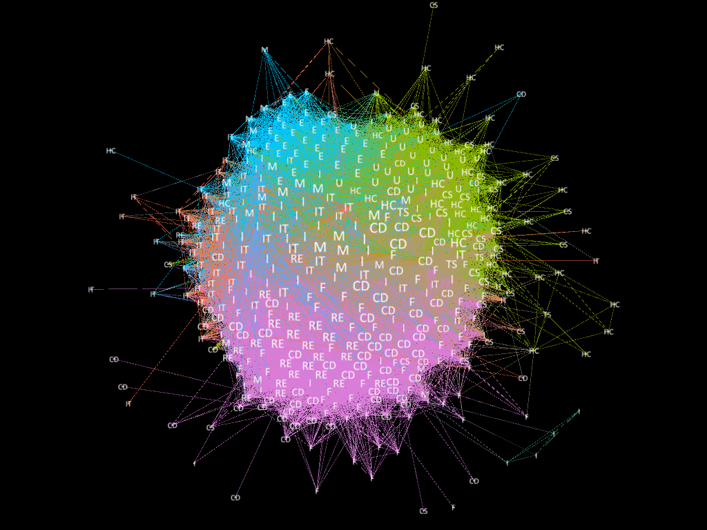
Applied the algorithm to stock data of 2015, the MST is displayed as following. The orange nodes in graph are the stocks in central portfolio and the green nodes are the stocks of peripheral portfolio</p>
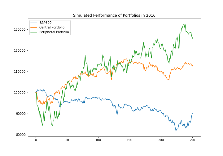
Simulation of Performance of Portfolios
Assume invest $100000 on the portfolio on 2016-01-01 and keep the portfolio for 1 year. As the figure shows, both the portfolios beat the market.